

Duration
4 days
Full Stack UX Designer
Role
Figma, Adobe Photoshop
Tools
User Research
Skills
Information Architecture
Content Strategy
Solo Design Challenge
Team
TL;DR
-
For the final round of the Google summer UX design internship, I had four days to complete a design challenge.
Prompt: Design an experience for students, professors, and members of the school community to reserve workspaces in the library. Consider the experience of checking availability, reserving the space, and reporting any issues.
-
Although students and professors were the intended audience for room reservations, I included library administration when persona building since they are the middleman between the users making the reservation and the library.
I performed a competitive analysis on four library types—private, public, community colleges, and public libraries to get a look at how reservations work across distinct spaces. I found that there were minimal options for filtering through available rooms especially when coupled with an unfriendly interface only compatible with desktops.
-
To outline the inputs and outputs of the reservation interface, I constructed a user flowchart. I used content models to establish what information was necessary on each page, who the audience is, the goal, and a high-level breakdown of each page's content.
These content models influenced my low-fidelity sketches. I knew I didn't have sufficient time to create pixel-perfect designs for this project, so I used my comprehensive sketches to create a wire flow and user journey map based on the users' click path for reserving a room. I annotated the wire flow to illustrate the functionality of each feature.
A responsive tablet interface of the app was designed accounting for the 52% of students who own tablets. The next iteration would incorporate a map filter view, reminders for reservations, and an internal system for library administration to manage and resolve problems that arise after booking.
Using two-factor authentication, university members can easily access the library’s room reservation platform using the colleges’ internal app. The solution enabled users to conveniently sort through available rooms using a wide range of filters, such as noise level, amenities, and building types. They could rent out technology equipment, accessibility tools, and study materials, as well as add guests to their reservation bookings.
Use the embedded Figma file to click through the final wire flow. To view the in-depth reasoning for the features implemented, click “View Solution” below to explore low-fi solutions.
Process Detail
Process Deep Dive: If you have time to explore my work, keep reading!
Background
For the final round of the Google summer UX design internship, I was given a design challenge to complete within four days.
Mind Map
I created a mind map to note my initial ideas and unanswered questions while identifying any assumptions I had that needed validation. The mind map lead me to question the types of rooms booked at libraries, procedures/time limits, and existing user journeys.

DESIGN PROMPT“Design an experience for students, professors, and members of the school community to reserve workspaces in the library.”


As generative research, I wanted to know as much as possible about the current experience, journey and struggles students and professors have reserving a room. My research included user interviews with students and professors, competitive analysis, task simulations, and empathy mapping to help solidify project goals.
Problems Identified
I researched four library types from private, public, community colleges, and public libraries to see if there were distinct differences between them. To see what’s currently happening in the space, I analysed how room reservations occurred specifically looking at filter types, building types, issues with reservations, logistics of booking a room, interface choices and personal information that was needed to securely reserve a room.
Competitive Analysis


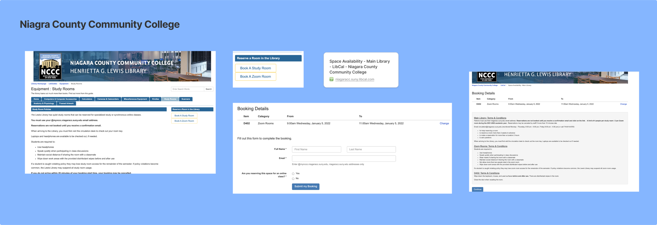

-
- Most schools used TWA for any school-related checkout process
- TWA streamlines the confirmation process using the schools’ established system
-
- Limited room filters, primarily based on capacity, building type and room description
- No map of the building and floor were included
-
- Most schools used a spreadsheet calendar scroll which only worked on web, fickle on mobile and tablet
- Schools rarely had a review page for the reservation before checkout
The student and professor personas were already highlighted in the prompt; however, there was a tertiary persona that was missing from the room reservation experience. Library Admin are integral to this process and frequently communicate with students and professors working out any issues that arise. I created personas and empathy maps for each of the three users—students, professors, and library administrators—to better understand their particular needs and influences while making room reservations.
Building Personas

Elena has fallen behind in a couple of classes and needs to catch up before exam week. She’s looking for a space to study without distractions from friends and her roommates.

Professors and faculty members face different challenges than students. They are bogged down with mandatory meetings without prior notice, so are left to reserve rooms last minute.

Richael, the library admin, fields the same questions from community members and wishes the interface was user-friendly to divert questions and focus on other library operations.
After identifying the goals and driving forces of the various personas, I set up a user flowchart mapping the user’s journey. From opening the application to confirming their reservation, this process simplified the prototyping process since the inputs and outputs were mapped out in detail.
Flowchart Mapping
Approach
I used the content model to explicitly define what information was required on each page, who the audience was, the purpose, and a high-level breakdown of each page's content before beginning to sketch wireframes.
Content Model
The content sheets influenced my low-fidelity sketches. I knew I wouldn't have time to make pixel-perfect designs for the challenge due to the short time frame, so I used my comprehensive sketches to construct an annotated wire-flow and user journey map based on the user’s click journey.
Sketches
HOW MIGHT WE?How might we present a room reservation interface that is intuitive for various members of the school community to seamlessly book available library spaces?
Low-fi Solutions
Key Features Implemented
As a member of the university, users would be able to access the reservation service through a tile on the college’s existing app. This ensures easy access and navigation to other important university resources.
College App Main Page
Since finding available rooms is the main objective of the application, the homepage opens to a filtering screen. Users can filter based on building type, room type, date, time and capacity. The three most popular filters will be conveniently located under the search bar.
Ex. Room types: open study, private study, studio, conference rooms [8-20] 2-person, 4-person, computer rooms [faculty]
Homepage
The ‘get help’ section is located on the about page. Users who need more help or have lost or forgotten something in their reserved room can use the feature for assistance. A map is shown after submitting the form so users can find the front desk assistant if they are currently in the library.
About/Get Help Page
To ease the workload of the library administrator, FAQs have been included. Staff from the library would help to curate the questions and responses. The hope is that these 5-10 questions will act as a deterrent and relieve some stress for the administration.
FAQs
The building and floor where the room is located are listed on the room details page along with a photo of the space. The room's specifications are listed on this page, with the room's type, capacity, table/chairs, and accessible features. Users can locate the building with ease thanks to an attached map.
Room Info
On the booking page, a summary of the room details are listed. Accessibility equipment, whiteboards, projectors, computers/laptops, and other media tools are just a few of the extras that users can add to their reservations. Combining the technology rentals with the room reservations means library admin have ample to take stock of those tools and place them in the respective rooms while reducing the time users spend borrowing tools before studying.
Booking Page
Users have the option to add guests to their reservation using their university email address. Guests that are added will receive an initial confirmation as well as reminders on the day of the reservation.
Add Guests
Before making the final reservation, users can review their room selection on the booking review page, helping to reduce errors and the number of cancellations. It will act as a buffer for them to double-check and reduce internal fixes from library staff.
Booking Review Page
In addition to the mobile mockups, I decided it was important to sketch out a responsive tablet view. Over 52% of college students have a tablet, so it’s important to ensure my designs flowed across users’ preferred platforms.
Responsive Tablet Homepage
Reflection
Designs never truly reach their final state. Given the short timeline, I’d love to ideate, iterate, and improve certain features I didn’t get the time to fully research and design.
Hi-fidelity isn't always needed: I had to make tradeoffs since I had four days to complete the design challenge. The current reservation process had issues, and my goals were to bring attention to them, guarantee a positive user experience, and deliver solutions that solved specific user pain points. Since the timeline didn't allow for a high-fidelity prototype, I believed a detailed and documented low-fidelity prototype would be more effective.
Design is Collaboration: Without feedback and critiques from others, you tend to design in a bubble. Although working on this project allowed me to see my personal growth as a designer and product strategist, it also reinforced the importance and benefits of collaboration during the design process.
Next Iteration
1. Library Admin - Get Help Page: The ‘get help’ section focused on the front-end user interaction, the next iteration will focus on the back-end interface for library administration to manage and address unresolved concerns.
2. Reservation Reminder: Users will be reminded of their room reservation day of, including the building and floor. This is a precaution set to mitigate missed room reservations and empty study rooms.
3. Map Filter View: The map filter view will allow users to visually see where their building is located taking into account their dorm, classroom, etc when searching for available rooms. This feature benefits those who will use a room before/after a class or meeting.
4. Favourite Feature/Previously Booked Tab: Users that like a room that they’ve booked in the past can add it to their favourites for an easy and seamless rebook for next time. Universities often have a myriad of rooms to book, so this helps users create a curated list of rooms close to their dorms and classes.